
Flexin' In style!
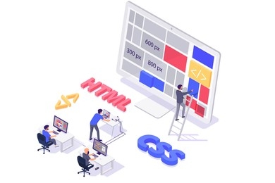
It's been nice to revisit the world of HTML and CSS. Though I couldn't quite
place the distinctions between relearning now and in college, I can definitely
sense the improvements. It is undoubtedly better, however I'm not sure if it
is due to the availability of several code editors or because it is easier to
find solutions to things on the internet.
I always try to find good analogies for things that I know very little about.
It seems to always help my brain understand things easier. So like anything
else, I used this method with Display and Position properties. I relate the
Display property being alot like actors on a stage. Each actor has a
role/character that it provides.The Display property would determine how the
actors will present themselves on stage.
- display: block; Elements with this property value will start on a new line and take up the full width available.
- display: inline; Elements with this property value will not start on a new line. They will only take up as much width as necessary, and multiple inline elements can appear on the same line.
- display: inline-block; Similar to inline, but allows setting width and height on the element.
- dispaly: none; The element will be completely removed from the layout and not displayed on the webpage.
- display: flex; Enables a flex container, allowing you to use flexbox properties to control the layout of child elements.
- display: grid; Enables a grid container, allowing you to use grid properties to create complex layouts.
The second analogy is not mine but it is a good one for position. The position property is like a bulletin board of notes. The position property is the decision of where you are placing the notes. In this analogy, the bulletin board represents the HTML document, and each note represents an HTML element.
- position: static; Default value. Elements are positioned according to the normal flow of the document.
- position: relative; Positioned relative to its normal position. It can be moved with the top, right, bottom, and left properties.
- position: absolute; Positioned relative to its nearest positioned ancestor (if any), otherwise, it's positioned relative to the initial containing block.
- position: fixed; Positioned relative to the viewport. It won't move even if the page is scrolled.
- position: sticky; Acts like relative position until an element scrolls to a specified point, then it becomes fixed.