
BEM: The CSS Dream

If you have ever ventured into the field of web development, you may have encountered the acronym "BEM." No, it's not an acronym for a covert organization; rather, it stands for Block, Element, Modifier, a CSS organization technique that keeps you sane and your work organized.
BEM is essentially just a naming scheme for your HTML and CSS classes. It separates your code into three primary parts: Elements, Modifiers, and Blocks. Similar to a button or navigation bar, a "Block" is an independent part of the system. Its "Element" is a component, and its "Modifier" modifies the block's or element's style. Because of the distinct hierarchy this structure establishes, your code is easier to read and update.
Let's take a common scenario: styling a button. In traditional CSS, you might have a class like ".button" and then add more classes for variations like ".button-red" or ".button-large." With BEM, you'd structure it like this:
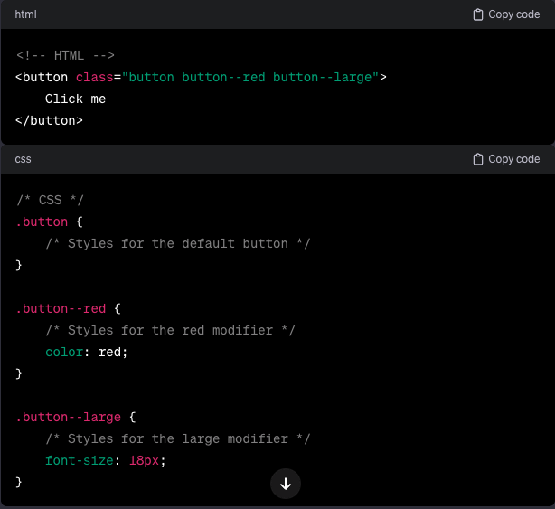
By following this pattern, you create a modular and scalable system. Need a red button? Just add the "button--red" class. Want a large button? Toss in "button--large." It's that simple!
For developers, BEM is a game-changer, not just a fad. Adopting BEM will help you work with other developers more effectively, decrease the likelihood of style conflicts, and improve the maintainability of your codebase. Plus, you'll be grateful for BEM's clarity when you go back and review your code in a few months.
In conclusion, while BEM may appear to be just another coding convention, web developers consider it to be a superpower. In the long run, adopting BEM is a small investment that pays off big time because of its simple structure and practical benefits. Therefore, keep in mind the power of BEM the next time you're styling a webpage and let your code shine with simplicity and organization.