
Rulers of the Digital World
In today's digital age, blah blah blah, yeah, I started my last blog this exact way. I am out of creativity this week, sorry! Creativity can be a struggle, and like anything else in the world, learning something new can also feel like a struggle. As web design evolves, so does the fact that there are always different methods of madness. So choosing the right "ruler" can make all the difference that helps create responsive websites.
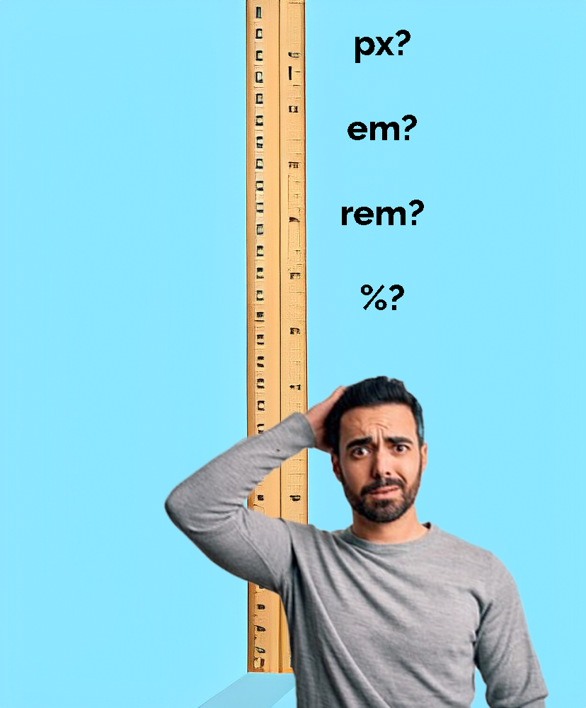
Pixels (px) are like the building blocks of your webpage. They are great for things that need to stay a specific size, like borders, icons, and images. However, they might not adjust well on different screen sizes or high-resolution screens.
On the other hand, em's are flexible because they scale based on the font size of their parent element. This means that text sizes within different parts of your webpage will adjust proportionately. While this is great for making text responsive, it can sometimes lead to unexpected font sizes, especially in deeply nested parts of your webpage.
Rems are similar to em's but they scale according to the root font size of your whole document. This makes them consistent throughout your webpage and perfect for responsive design. Your webpage will look good and work well on various screen sizes.
Percentages are like chameleons because they adapt to the size of their container. They are useful for defining margins, heights, and widths within sections or grids, ensuring that everything stays in proportion to its container.
- px- Great for fixed-size elements that shouldn't change, like icons and borders.
- em- Perfect for adaptable typography within sections, like headings and paragraphs.
- rem- Ideal for consistent scaling across the entire layout for responsive design.
- percentages- Chameleons of the group, adapt size and position based on their container. Perfect for defining flexible elements within sections or grids, maintaining proportions relative to their surroundings.